Many nonprofits live and die by Google Analytics. But there’s another tool that shows you something Analytics can’t: exactly where people’s attention (and mouse) goes, and more importantly, where it doesn’t. That’s where heatmaps come in. Heatmaps (not to be confused with your local summer weather forecast) show you the hot spots where visitors click, scroll, and hover on your website—and the cold zones nobody notices.
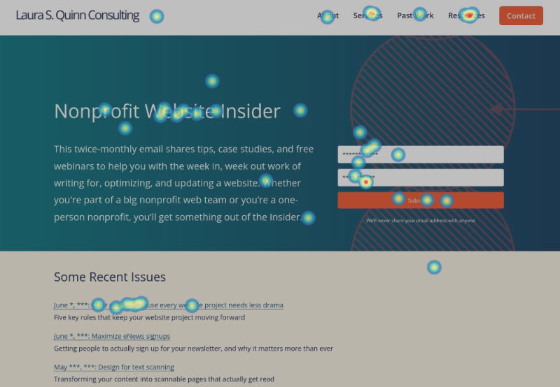
A heatmap showing clicks on the old Nonprofit Website Insider subscription page… helping me to optimize the new site!
Heatmaps are surprisingly handy for both quick detective work or as part of your ongoing metrics plan. Here’s some of the things you can learn:
- Homepage habits: Do people scroll past the top, or do they bail out early? Are they clicking on your sidebars and calls to action, or breezing right by? Sometimes important call outs get ignored—all too often, visitors will instinctively feel that boxes along the right of the page on desktop are ads, and don’t even notice them.
- Fundraising forms: If donors keep dropping off at the same spot, that could mean a confusing question or a field that’s a little too personal. Or maybe your form is hiding way down the page where no one ever sees it. Heatmaps show you what’s drawing attention: images, text, or something else entirely.
- Info-heavy pages: Are visitors scanning your headers? Is your big hero image doing its job, or just taking up space? If you use accordions, heatmaps reveal which sections people actually open (and which are just along for the ride).
Getting started is simple: tools like Hotjar and Crazy Egg let you add a snippet of code to the pages you want to watch. Just do this carefully if you have a lot of visitors since this can slow down the performance of those pages. Most of these tools start around $20–$30 a month, and there are usually free trials or limited plans.
A few minutes spent with a nonprofit website heatmap can highlight small changes that might make a big difference. Next time you’re wondering what’s working, let the colors do the talking.
Dive Deeper
What Are People Actually Doing on Your Website? The Power of On-page Analytics | Constructive
A practical introduction to using heatmaps and other on-page analytics for nonprofits, using Crazy Egg in particular. Perfect if you’re tired of guessing why people aren’t clicking your donate button—this shows you exactly where visitors are actually clicking, scrolling, or getting stuck so you can fix the trouble spots that are quietly sabotaging your site.
Video! How to Use Website Heatmap Data to Improve Your Site | Clicks Don’t Lie
Another great introduction, this one in video form, to reading and interpreting heatmaps. Because sometimes you need to see someone else point at the colorful blobs before it all clicks.
Website Heat Maps: Definition, Examples and Analysis | Impression
The comprehensive deep-dive into different types of website heatmaps—click maps, scroll maps, and the wonderfully named “rage click” maps (yes, that’s when people frantically click things that aren’t actually linked). Packed with detailed examples and case studies, including one nonprofit that increased donations 29.5% just by fixing their frustrating donation form.